Silver (XAG/USD) Analysis
- Fed comments led to a wild swing in interest rate expectations which weakened the dollar
- Silver technical analysis and key levels to note: 23.30 fulfilling role of support
- The analysis in this article makes use of chart patterns and key support and resistance levels. For more information visit our comprehensive education library
Recommended by Richard Snow
Learn how to gain confidence in your trading approach
Interest Rate Expectations Swing Wildly
A drastic turnaround in market expectations over the last 24 hours now sees a strong preference for a no hike situation from the Fed after prominent voting members, Patrick Harker and Philip Jefferson communicated their preference for a “skip” when the FOMC committee next meet on 14 June. The one-eighty degree turn has pulled the rug out from underneath the dollar, causing a reprieve in dollar denominated commodity markets like silver.
The chart below shows the CME FedWacth Tool for 31 May (left image) and then 1 June (image on the right). The market implied probability of a rate hike on 31 May was around 71% then on the first day of June markets priced in a 73% chance of no hike.
Source: CME FedWatch Tool, prepared by Richard Snow
Silver Technical Analysis and Key Levels to Note
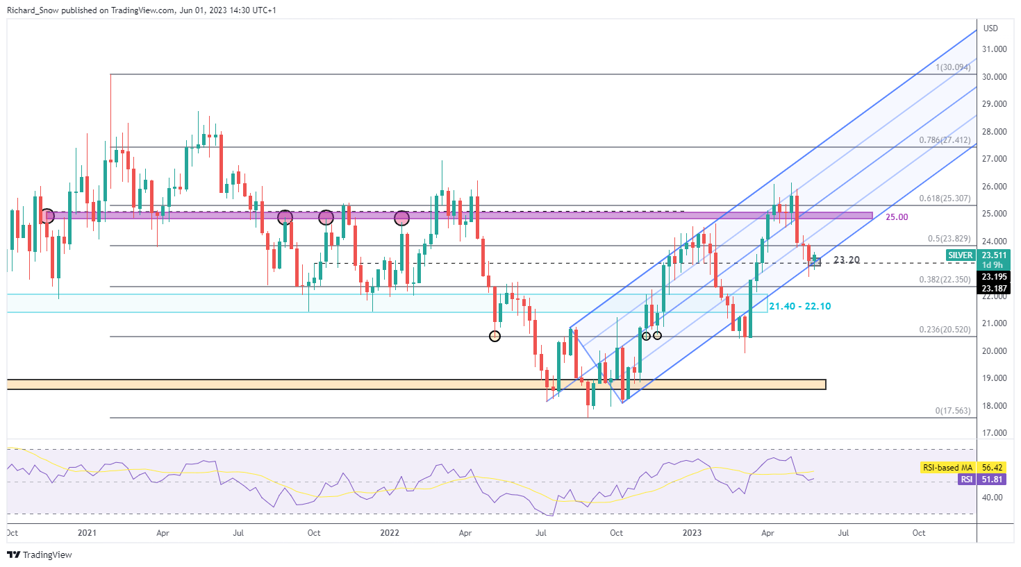
In the previous update, the 23.30 area was identified as a potentially significant confluence zone. The zone comprises of the underside of the ascending pitchfork which has largely contained price action, and the 23.30 horizontal level which doubled up as prior resistance and support. Today’s trade has silver on track to reclaim some lost ground – moving higher off the confluence zone around 23.30. The longer-term bullish trend remains intact and supports the early signs of an advance from current levels. In the event this initial move higher gains traction, $25.00 becomes the next level of resistance followed closely by the 61.8% Fibonacci retracement of the major 2021 – 2022 move at $25.30. Support lies at $23.30.
Weekly Silver Chart

Source: TradingView, prepared by Richard Snow
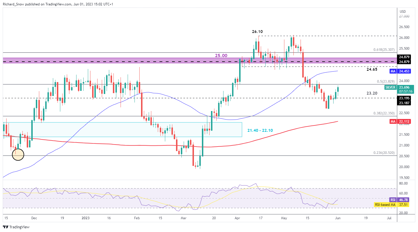
The daily chart helps provide more granular detail on recent price direction as the metal moves away from the 200 SMA, heading towards the 50 SMA (blue line). The recent decline in silver means and subsequent bounce higher has resulted in the market moving from oversold territory back within the normal range, providing an improved risk-to-reward ratio for bullish continuation.
Daily Silver Chart

Source: TradingView, prepared by Richard Snow
Trade Smarter – Sign up for the DailyFX Newsletter
Receive timely and compelling market commentary from the DailyFX team
Subscribe to Newsletter
— Written by Richard Snow for DailyFX.com
Contact and follow Richard on Twitter: @RichardSnowFX

Leave a Reply