British Pound Vs US Dollar, Australian Dollar, Japanese Yen – Price Setups:
- GBP/USD still looks heavy despite the recent retreat.
- The sharp pullback in GBP/AUD raises the risk of a deeper setback in the short term.
- GBP/JPY has been struggling to break past key resistance.
Recommended by Manish Jaradi
How to Trade GBP/USD
In a relatively light week regarding UK macro data, the British pound could be at the mercy of some of its peers.
After a spectacular run of outperformance since February, UK macro data have generally underwhelmed since mid-May, according to the Economic Surprise Index. Nevertheless, the strong-than-expected data since the start of the year has prompted upgrades to the economic outlook for the current year. Meanwhile, the slower-than-expected moderation in UK inflation in April has raised the odds of a Bank of England (BOE) rate hike this month.
BOE hiked its benchmark rate by 25 basis points in May after pausing in April, and the market is pricing in almost four rate hikes by the end of the year, taking the terminal rate to 5.41% from 4.50% currently. The next week bring UK jobs, GDP, and manufacturing output data ahead of the BOE meeting on June 22, which could stir things up a bit for GBP. Until then, the pound could be due for a breather after a spectacular run against some of its peers.
GBP/USD Daily Chart
Chart Created by Manish Jaradi Using TradingView; Notes at the bottom of the page
GBP/USD: Looking heavy
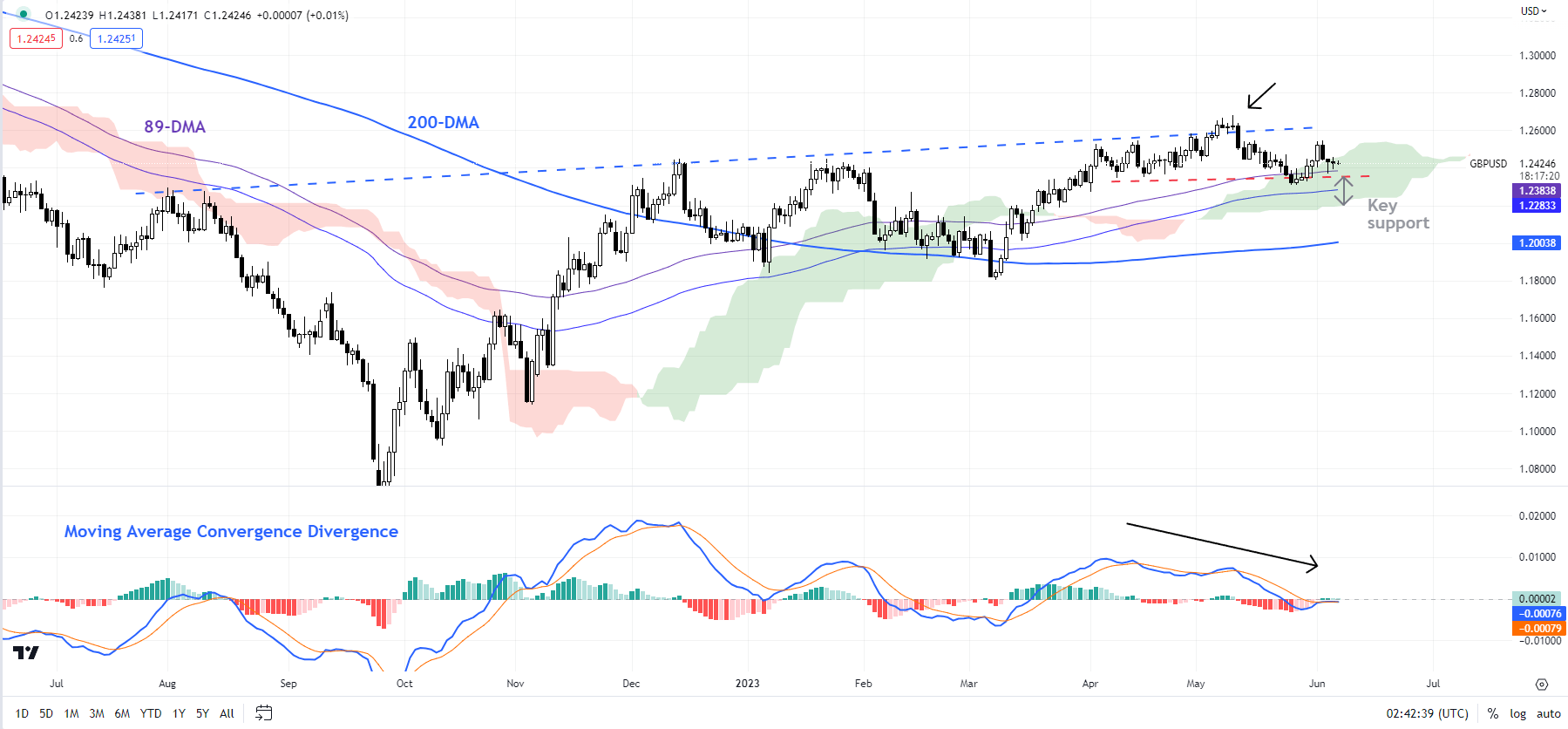
On technical charts, GBP/USD has moved to a consolidation phase within the overall bullish phase on the daily charts, as the colour-coded candlestick charts show. Short-term momentum continues to be weak, pointing to some more softness in the pair. For more discussion see the previous update “British Pound Shrugs Off Blistering CPI: What’s Next For GBP/USD, EUR/GBP, GBP/JPY?”, published May 25.
GBP/USD Daily Chart

Chart Created by Manish Jaradi Using TradingView
Any break below the immediate cushion at the end-May low of 1.2300 could open the downside toward 1.2200 initially, potentially toward the 200-day moving average (at about 1.2000). Zooming out, from a medium-term perspective, the rise this month to a one-year high in May confirmed the higher-tops-higher-bottom sequence since late 2022, leaving open the door for some medium-term gains. (see “British Pound Buoyant Ahead of BOE: How Much More Upside?”, published May 8).
GBP/JPY Daily Chart

Chart Created Using TradingView
GBP/JPY: Struggles to clear channel resistance
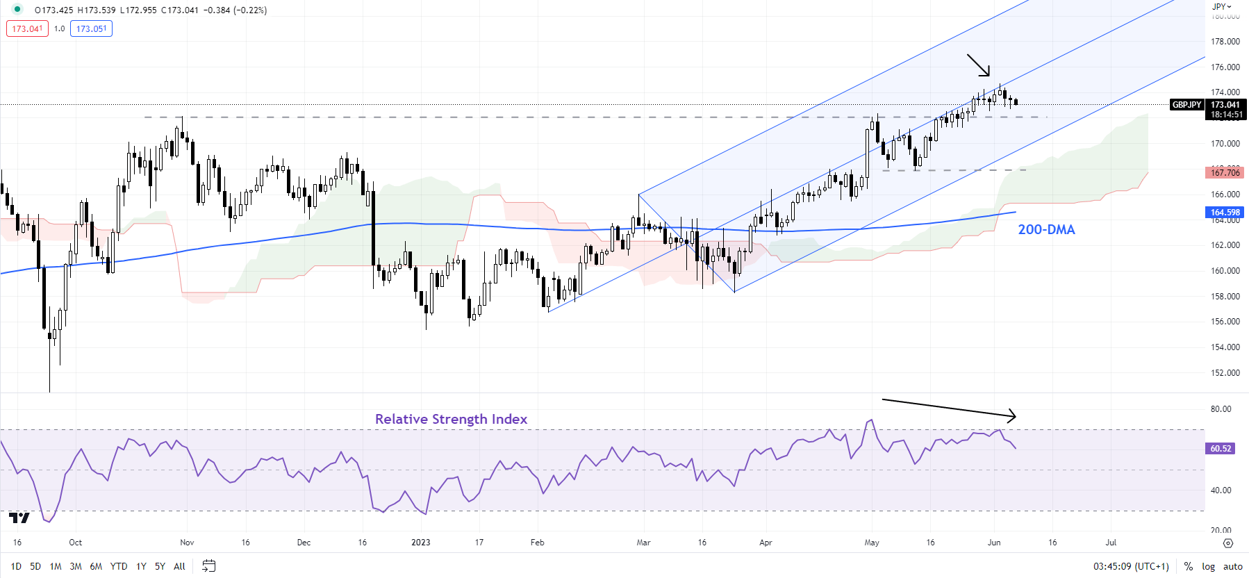
Odds of a setback inGBP/JPY’s rally are growing in the near term as it has struggled to break past resistance on the median line of a pitchfork channel since February (see chart), not too far from a tough barrier at the October high of 172.10. Any break below 172.00 would indicate that the upward pressure had faded for now, opening the door for some consolidation/minor retreat. Initial cushion is around 171.25, stronger cushion is seen at the mid-May low of 167.85.
Beyond the short term, as highlighted in the previous update, there are no signs yet of a reversal of the five-month-long uptrend, but the evolving price action suggests the cross may need to take a breather.
GBP/AUD Weekly Chart

Chart Created Using TradingView
GBP/AUD: Ripe for a deeper setback?
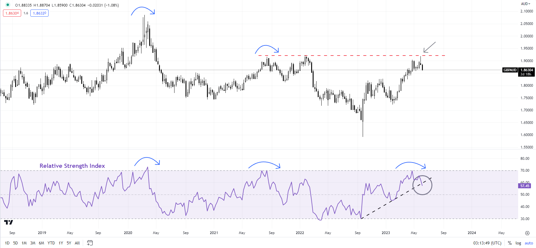
GBP/AUD’s sharp retreat in recent days has made the cross vulnerable to a deeper setback in the near term. This follows a retreat from strong horizontal trendline resistance at about 1.9200 (see chart). The 14-week Relative Strength Index has retreated from overbought conditions – levels that have been associated with a pullback in the cross. GBP/AUD is testing a vital floor at the early-May low of 1.8590, so some rebound can’t be ruled out. But chances are that it won’t hold the support for too long. Any break below could open the door toward the early-April low of 1.8250.
Note: In the above colour-coded chart, Blue candles represent a Bullish phase. Red candles represent a Bearish phase. Grey candles serve as Consolidation phases (within a Bullish or a Bearish phase), but sometimes they tend to form at the end of a trend. Note: Candle colors are not predictive – they merely state what the current trend is. Indeed, the candle color can change in the next bar. False patterns can occur around the 200-period moving average, or around a support/resistance and/or in sideways/choppy market. The author does not guarantee the accuracy of the information. Past performance is not indicative of future performance. Users of the information do so at their own risk.
Recommended by Manish Jaradi
Get Your Free Top Trading Opportunities Forecast
— Written by Manish Jaradi, Strategist for DailyFX.com
— Contact and follow Jaradi on Twitter: @JaradiManish

Leave a Reply